Midtown Shangri-La is a restaurant in the beautiful city of Atlanta. Atlanta has evolved from a city of the regional economy into a bustling city of international influence. Strategically situated within the vibrant business district, this Cantonese restaurant aims to serve many customers. Midtown Shangri-La’s interior perfectly matches the panoramic view of the Atlanta skyline. If you’re looking for a big-city food adventure, it’s hard to beat Midtown Shangri-La’s eclectic atmosphere and authentic Chinese fare.



Design, Style, and Color
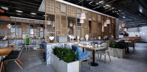
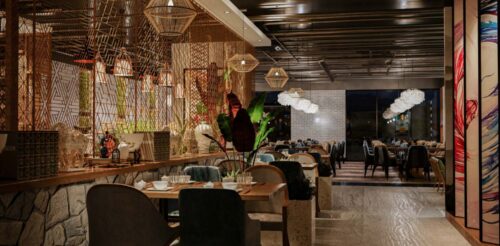
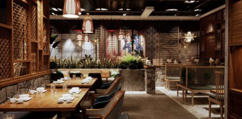
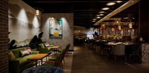
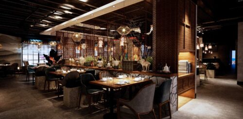
The restaurant’s charming interior design makes it the finest remote hideaway at the heart of the modern city. We divided the area into four sections with unique styles. We used custom dividers with geometric patterns to give them a more homey feel.
Each section has different furniture sizes and styles, giving customers more options in small or large groups. Meanwhile, the variety of plants beautifies the interior and freshens up the air within the dining area.
As for the colors, we are inclined to deep earth tones, focusing on chocolate brown, moss green, taupe, and gray. These colors draw inspiration from the outdoors and always make the design cozier and visually appealing.
Flooring Design and Materials
The flooring design and materials play an essential role in interior design. For Midtown Shangri-La, vinyl flooring was our ultimate choice. Each section has brown vinyl flooring in plain, geometric, and herringbone patterns. This way, finding the right furniture to achieve the overall layout that fits the restaurant’s overall personality is easier.
Ceiling Design
The three sections of the restaurant use hardwood ceilings in dark chocolate brown color. One unit has a tubular steel ceiling which creates a modern industrial vibe. We opted for different ceiling designs to give every part of the restaurant a unique, complementary look.
Wall Design
Interestingly, you can find walls and partitions of varied materials and designs as you go around. You’ll see solid wall panels, bamboo partitions, and custom dividers with various cut-out patterns. We had to maintain breathability in the space because our client didn’t want the restaurant to feel cramped. Besides, this technique added to the individuality of each section, making it intriguing to diners every time they visit. Plus, the younger generation will surely love the place for being Instagram-worthy.
Lighting
We opted for rattan pendant lights and elegant chandeliers for the lighting fixture. We also added enough LED pin lights on the ceiling to illuminate the whole place. In addition, combining yellow and white lights give the restaurant an ambient glow. It provides visibility and comfort, especially in spaces with heavy foot traffic.
Meanwhile, the wall dividers with cut-out patterns bring more natural light between the dining areas. Aside from aesthetic purposes, it also promotes sustainability and cost-effectiveness.
Atmosphere
The idea of giving a unique design for specific sections of the restaurant is to make it more homey, relaxing, and comfortable. The layout and materials are carefully chosen to give customers warmth and a positive impression.
As you enter the restaurant, you’ll be greeted by their friendly staff, who will let you choose the most comfortable set-up. Whether you are a couple or a large troop, space is always designed for you. Likewise, you don’t have to worry about the restaurant being congested on busy days or hours because the furniture is appropriately arranged.
Our client ensures you’ll have a memorable dining experience as you celebrate many essential events at Midtown Shangri-La.
Furnishing
Wood and marble are the top choices for tables. For chairs, we used various designs, colors, and materials. We mixed and matched several benches, bar stools, velvet cushioned chairs, and tufted armchairs.
The bar has open shelving units that make it tidy and organized. We also adorned the place with plants in decorative pots and concrete plant boxes. This is a practical approach to incorporating nature with the modern interiors of the restaurant.
We added a few art pieces and ceramic figurines to finish the look. We did it in moderation to avoid too many decorations inside the diner.
Similar designs
View all »Our locations
San Francisco, CA
535 Mission St, San Francisco, CA 94105
Philadelphia, PA
1100 Ludlow St, Philadelphia, PA 19107