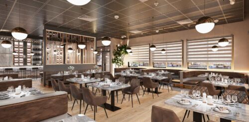
Ammie Restaurant is a casual dining restaurant that serves Southeast Asian fusion cuisine. The full bar serves cocktails, drinks, and tapas past 5 pm. When you’re looking for a place to unwind with good food, you’d want to catch a break at Ammie, where you can get a mix of regional dishes and finger food to pair with drinks. The Thai-Filipino chef-owner, who trained in Italy and Austria, collaborated with Spencil to create this minimalist and elegant interior. With a perfect balance of neutrals and texture, it’s the perfect place to pay a charming homage to the Southeast Asian tropics. For the chef, the dream of opening his own restaurant has always been the end goal of his career. And after doing popups for three years, the LA-based chef is finally ready to settle down in his home restaurant and invite patrons to unforgettable meals.


Design, Style, and Color
The monochrome palette gives the restaurant an unintimidating design. In fact, this was a design request by the chef, who wanted to elevate Southeast Asian food while also making it accessible. When you visit Ammie, you will encounter foodies who are looking to try more than just your average stews or skewers. Here, you’ll get a full spectrum of flavors – the perfect mix of sweet, sour, salty, and spice the region is known for.
As you sink your teeth into adobo, pad thai, tom yum, and lechon kawali, the restaurant’s neutral interiors offer the perfect relaxed background, allowing you to focus your senses on the feast before you without being distracted by visual noise.
Flooring Design and Materials
Ammie Restaurant offers more design-wise than initially meets the eye. While the monochrome look may be boring for some, they dress it up by adding texture to their design choices. You can see it in their choice of flooring materials. Here, you get a mix of neutrals. Gray-colored marble runs the length of the restaurant, while a wooden plank brings texture to the central dining area.
Ceiling Design
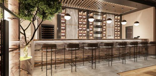
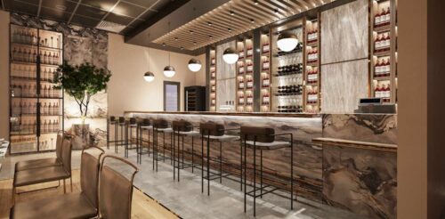
The ceiling design, meanwhile, has a simpler story. With a straightforward black and gray grid design, the restaurant keeps it practical with exhausts strategically placed over certain squares. The clean lines of the ceiling draw the eyes to the design accents, such as the lighted bar ceiling and dapper liquor shelves.
Wall Design
The wall design offers a simple beige neutral, but another hero piece is the intricate divider that divides the bar and the restaurant. It’s a simple yet effective way to offer more privacy to customers near the bar area.
Lighting
Ammie Restaurant isn’t trying to put out a strong message. Unlike other establishments that try to speak first with their interiors, Ammie prefers you hold your judgment until you try their food. Instead, the restaurant focuses on providing a quality dining experience. Lights are strategically placed over certain areas to provide well-lit candle dinners, and the seating layout provides enough privacy for customers who want them.
For the lighting design, we went for fixtures that provide an illusion of glowing orbs. The lights are suspended from the ceiling using impossibly thin wires, giving the bright light a stark contrast against the monochrome interiors.
Atmosphere
Aside from the lighting, Ammie Restaurant uses its dining chairs to add the right texture to the simple layout. Leather, diamond quilted seats also add a much-needed pop of color to contrast against the neutral wood flooring. If you’re near the walls, you’ll be treated to curved leather furnishing that’s sleek and fun. On the other hand, sit at the bar, and you’ll get high wooden stools with tall steel legs and rigid back support.
Furnishing
One of the restaurant’s most eye-catching parts isn’t the dining area but the bar. It has an open counter design, with wine, whiskey, and glasses on display. In short, it’s a great spot if you want a more intimate setting. Finally, the mix of dark and light marble offers a hint of elegance against the wooden ceiling.
Ammie Restaurant cuts through the brown elements with a potted plant by the corner. It’s a chic and casual dining spot for a night out. Whether it’s meeting an old friend, taking a family member out to dinner, or celebrating an anniversary, it’s got potential for general appeal.
Similar designs
View all »Our locations
San Francisco, CA
535 Mission St, San Francisco, CA 94105
Philadelphia, PA
1100 Ludlow St, Philadelphia, PA 19107