JA Ramen is a new ramen restaurant situated in rainy San Francisco. The owner, Junko Aoyama, was looking for a ramen shop during heavy rain. But nothing satisfied her appetite. Instead, she decided to set up her restaurant based on her family’s ramen recipe and now serves different customers looking for comfort food. Plus, she added curry to spice up the menu. Our first thought when designing her space was a traditional restaurant in Japan. But Junko wanted to combine western restaurant interior design influences with the Japanese bar style. So, we mixed these two styles to create a coherent dining space.


Design and Style
We wanted diners to feel like they’re transported to Japan when eating at JA Ramen. Wood and bamboo were the only choices we needed to create our envisioned design. Japanese restaurants are heavy on these materials, and we ensured that it’s reflected in this restaurant. Plus, we wanted to honor Junko’s background through ornaments and decor.
Flooring Design and Materials
Ceramic tiles are the perfect choice for flooring. It’s a practical choice for restaurants, especially because of spills. But the tile color balances the lighter hue of the wood and bamboo.
Lighting
The perfect lighting was crucial to provide the best dining experience. We wanted to evoke the feeling of eating Japanese comfort food during rainy days. That’s why we didn’t rely only on natural lighting to create that vibe. Instead, we used lighting fixtures to brighten the space.
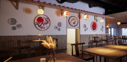
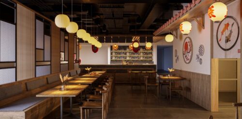
We used Japanese lanterns to house the bulbs. Plus, we ensured to add one lighting lantern per table. Variety was also important with lighting, so we added a big koi fish fixture on a larger table. In addition, we installed LED light strips on one wall to accent the paintings.
Atmosphere
JA Ramen caters to different diners, such as solo diners, professionals, couples, and families. And we set out to create a cozy atmosphere for this casual Japanese restaurant.
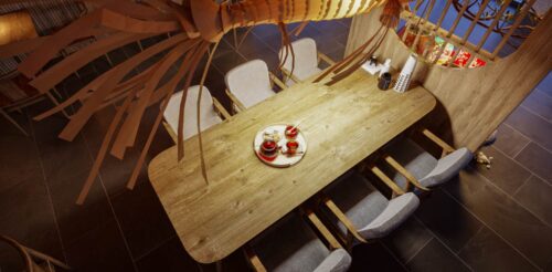
We dedicated four different spaces for various purposes. The long booth section can seat couples or large parties for a more intimate feel. Meanwhile, one area has a two-seated table for couples or solo diners. Having them separate from other portions can give them privacy when dining.
Another section is a table of six disconnected from other dining sections. It’s ideal for bigger families or professionals needing space from other diners. Finally, the bar is the best for solo diners, allowing them to dine in peace.
In addition, we applied ambient lighting per table and space.
Ceiling Design
The ceiling design was challenging since we wanted to keep the wooden style from top to bottom. But we drew from our original idea of mixing two design styles and kept a steel grid on one portion of the space while using wood for the rest. The steel grid doesn’t provide an aesthetic value but a functional one, ensuring that the acoustics contribute to the overall atmosphere.
For decorations, we hung red paper lanterns on the bar, which you would see in typical Japanese bars. And to complete the look, we also put up Japanese banners or signages commonly seen in any Japanese restaurant.
Wall Design
Wall decoration was necessary to create the feeling of eating in a Japanese restaurant in Seattle. First, we found Japanese-influenced art pieces to give the restaurant an authentic feel.
Secondly, we also positioned wall dividers on windows to let light in instead of blinds or curtains. Our goal is to blend two design influences. That’s why the partitions provide contrast. The circular hole divider is inspired by Asian pieces, while the geometric pattern is reminiscent of Western styles.
Third, we mixed up the design for one portion of the dining area to add decorative plates, circular wall hangings, and lanterns. Another banner drawn with two koi fish was hung to separate the dining area from the restroom and storage space. But the prominent piece in this portion was the addition of the Japanese roof to cement the Japanese look.
Finally, the bar area also houses decorative plates and circular hanging decors. But this time, wooden shelves store the alcoholic beverages served to diners.
Furnishing
We didn’t want to deviate from the wood motif of the overall restaurant.
We chose modern wooden seats with a low back for the dining area. They were paired with cushions to provide comfort. The booth also dons a wooden finish. And the bar has wooden stools with cushions.
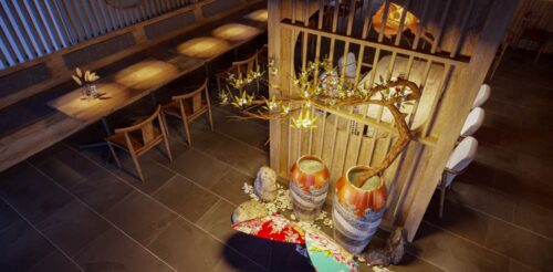
Finally, we didn’t leave the tables and floor empty. Each table has a decorative flower to complete an earthy look. Plus, a small patch of the restaurant was adorned with vases, two Japanese umbrellas, and stones to enhance the space.
Similar designs
View all »Our locations
San Francisco, CA
535 Mission St, San Francisco, CA 94105
Philadelphia, PA
1100 Ludlow St, Philadelphia, PA 19107