Design & style
The most important word in this entire project is “fun.” Regardless of our style or design language, the end result must be fun. Customers entering Cosmos has to feel like this is a place where they can relax and have a good time.
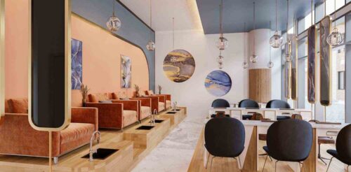
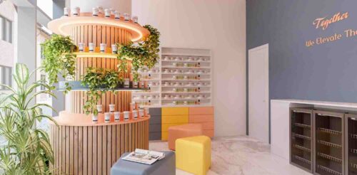
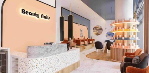
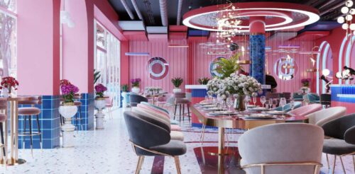
We chose a bright pastel palette of yellow, salmon, blue, and orange as the primary colors. Large slabs of marble were used in the front seating area to show cleanliness. Meanwhile, bamboo was used in the back area to encourage the “lost in nature” theme.
Gold accents and trims were tastefully added throughout to show a bit of class and elegance. Shiny gold trims can be tricky, especially when mixed with vibrant colors. Too much gold and the space can look tacky and obnoxious. A balancing act was needed to achieve Cosmos’ desired feeling.
Lighting
Fortunately the salon’s location was blessed with natural lighting from the massive floor-to-ceiling windows. The natural light was both a gift and a curse, since it’ll make most of our light fixtures seem pointless during daytime.
A ceiling indentation was created and inset lights installed underneath an indigo plate to complement the already well lit room. The ceiling plate’s dark indigo color will help soften the harsh outside light while giving way to the inset lights beneath. The result is a warm radiating glow that adds to the atmosphere.
Atmosphere
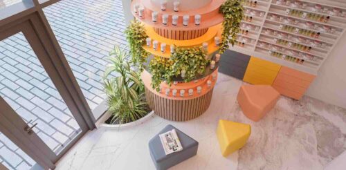
The building comes with a large support pillar that’s an eye-sore. Instead of allowing this massive structure to ruin the look of the salon, we decided to take advantage of it and built a bamboo shelf all around it. The pillar now serves as an artistic 360 shelf for decorations or displaying products.
Given the grand entrance to the salon, the reception desk needed a personality to match. Solid colors could be too distracting. Light colors could be easy to miss. Therefore, we went with a color dotted finish to make the reception desk stand out, look fun, but also perfectly fit with the overall aesthetic.
Furnishing
Decorating a colorful space is often tricky because you need to be selective where you splash colors. We wanted the vibrant colors to envelope customers as they walk through the room and sit down at either the manicure station or pedicure chair. To achieve the desired look, we made the front desk bright and colorful, along with the pillar shelves.
The manicure stations and raised pedicure area needed some contrasting colors. We installed white tables with a washed stone top and wood accent to soak in the light. To add vibrancy to the pastel backdrop, we chose rouge-orange corduroy fabric for pedicure chairs—all of this resting above bamboo finish flooring for an attractive look and ease of cleanup.
Towards the southern wall, we added a bamboo skirt to the half-pillar for a matching look. Pictures or decorations along this satin-white wall would cause sensory overload. So we opted for two carved-out planetary canvases instead to complete the picture.