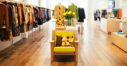
An entrepreneur must consider the space, products, and target market in choosing a layout that works for his business. In this post, we’ll show you 20 fascinating retail store design examples to help you plan the arrangement of your retail space.
1. Beige + Green

Pairing green and beige creates an earthy vibe that’s bright and lovely. The open shelving for product display makes it easier for the customer to shop inside this beauty and wellness retail store. Plus, the seating spaces within the store provide customers an area to comfortably sit and review shopping options.
2. Circular Product Displays

Strategic placement of products can impact your store’s popularity and sales. You should think outside the box! Creative product displays can catch the attention of your shoppers. These round platforms and racks in varied sizes are an excellent example of a well-planned retail store layout.
3. Eye-Catching Reception Desk Backdrop

The dark brown wooden columns serve as the backdrop at the reception/cashier counter. Likewise, the arts and decor add a little punch to this shoe retail store. More importantly, the dynamic displays make it easier for the customers to look over the products in the entire space.
4. Gold and Old Rose

The combination of high-end styling elements altogether yields an elegant retail shop. In terms of color, gold and old rose complement each other very well. Meanwhile, the minimalist product displays balance the store’s layout and aesthetic quality.
5. Blooming Flower Shop

This flower shop’s stunning interiors match the natural and artificial flowers on display. Also, the white and marble elements create an airy feel inside the shop.
6. Luxurious Layout

If you’re an owner or planning to start a high-end shopping spot, get inspiration from this retail store design featuring a French luxury brand. The hanging racks for clothes and a two-layer bag display are strategically arranged around the store.
7. Accent Walls

This earth-toned retail shop is accentuated with mirrors and two brown chairs. Meanwhile, the linear LED lights brighten up the boutique.
8. Grid Lines

Our next design idea has a unique personality. Instead of painting walls with a solid or two-toned color, the designer opted for a grid pattern. The confetti backdrop and matching table stand also invite a festive and happy atmosphere. Its Insta-worthy look encourages people to engage with your products and share them on their social media pages.
9. Ocean Blue

Indeed, an ocean blue interior fits an eyewear shop! It may seem like a small store, but the designer maximized it through multi-layer product displays. This design is for you if you are a business owner selling eyewear or other non-bulky items.
10. Chic Entryway

Surprise your customers with a chic display by the entryway. Creating a happy and relaxing mood as soon as they enter is a plus factor when operating a retail store.
11. Well-Adorned Reception Desk

Aside from the pretty entryway layout, it would help if you considered a well-decorated reception area. The desk is adorned with wreaths and a tall bird cage. Combining this look with the previous design is a surefire strategy to entice more customers.
12. Artistic Accent Pieces

Tufted benches are lined at the aisle of this perfumes and colognes shop. Also, the accent lighting highlights the products and key areas, indicating their importance in catching the eye of potential clients.
13. All-White Interiors

The floor, walls, and LED lights are all sparking in white. This option makes the area look big and organized.
14. Vines and Hand Sculpture

This retail store design has two main focal points. First, the climbing vines are at the center of the seating area. Its orange flowers brighten up the muted shops’ muted earth tone palette. Second, the hand sculpture displayed on the wall also catches people’s attention as they enter the room
15. Corkboard Frames

The shop’s unique layout reinvented the purpose of framed cork boards. Instead of displaying memos and whatnot, it shows the products of this apparel store. Whether new or upcycled, this unique idea is worth noting.
16. Angular Displays

If you want to create a non-traditional store layout, go for angular shelving units. And sticking with only one color makes the store look clean and tidy while highlighting the items on sale.
17. Keep Up With the Seasons

For your retail store design to stay relevant, it should evolve with the seasons. This will help your business be more connected to your customers’ lives. It also takes advantage of the buying potential through seasonal and holiday-specific layouts and decors. To achieve this, you need a flexible design for more efficient removal and installation of seasonal elements.
18. Eye-Popping Colors

The bright red retail store with yellow accent chairs is genuinely exceptional. Its happy and inviting look will gather loyal customers in no time.
19. Attention-Grabbing Digital Signs

Use LCD or LED to display your ads, featured products, and other information inside your boutique. It is excellent for catching people’s attention and connecting with customers.
20. Less is More: A Minimalist Retail Store Design

The bottomline for designing a minimalist retail outline is for the surroundings to be clean, neutral, clutter-free, and pleasing to the eyes. So, it is crucial to plan your floor plan before deciding on the shelves and decorations. You can do this even without the help of an interior designer. However, it is much easier with the assistance of an experienced one.
If you’re interested in hiring a professional interior designer at Spencil, click here to request a quotation.
